FOUR STATEMENTS
Using 4 statements as 4 distinct voices, finding the appropriate typefaces to represent the tone of each voice. Expanding on the personality of each voice with dynamic compositions.

1
Cover wrapped up
6 x 9 inches
2
Cover folded out halfway, quotes printed on inside of cover, half title page visible next to quotes.
3
Folded out all the way. Pages are visible (in gray). Hand bound cover.
Cover wrapped up
6 x 9 inches
2
Cover folded out halfway, quotes printed on inside of cover, half title page visible next to quotes.
3
Folded out all the way. Pages are visible (in gray). Hand bound cover.
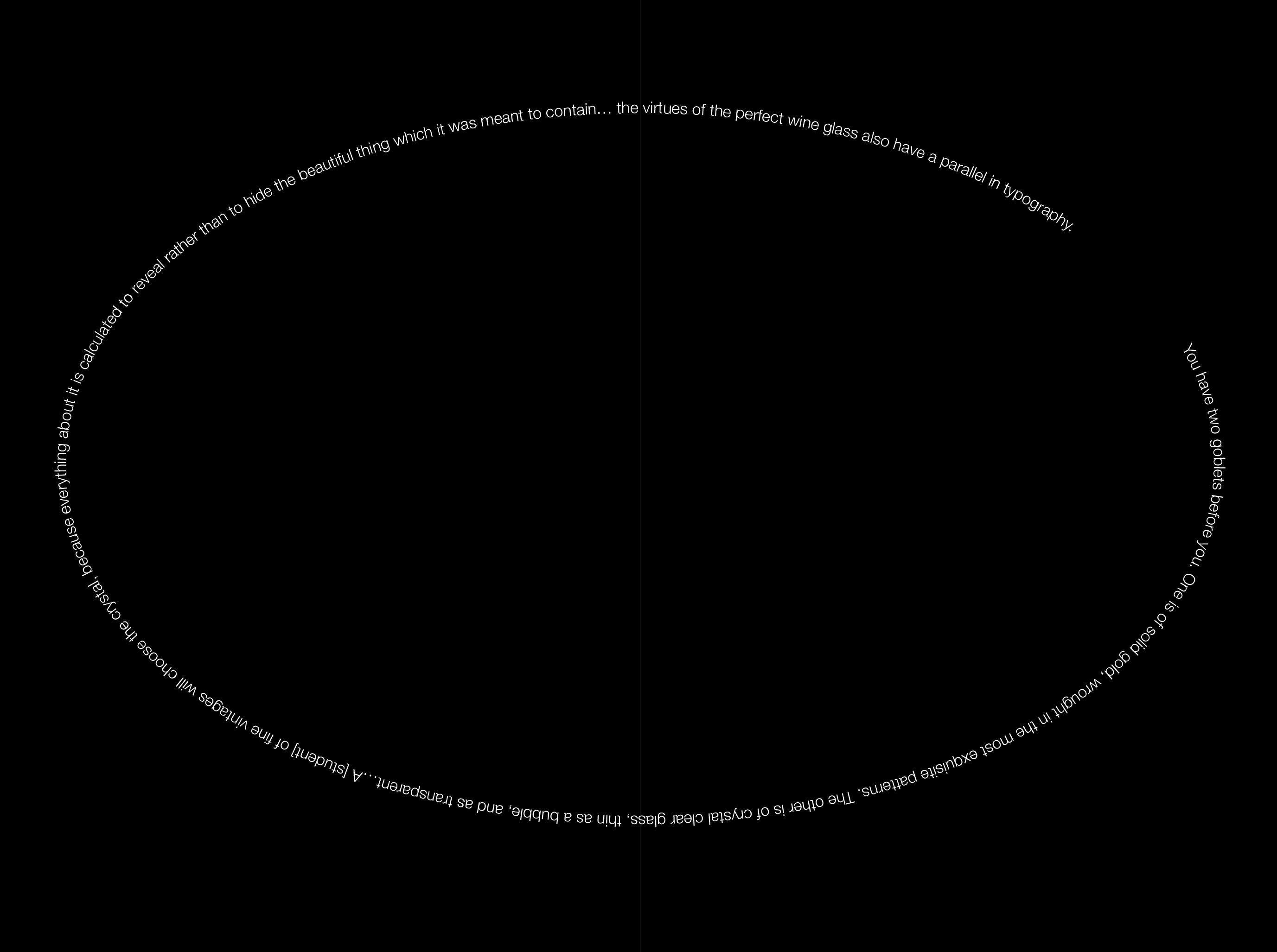
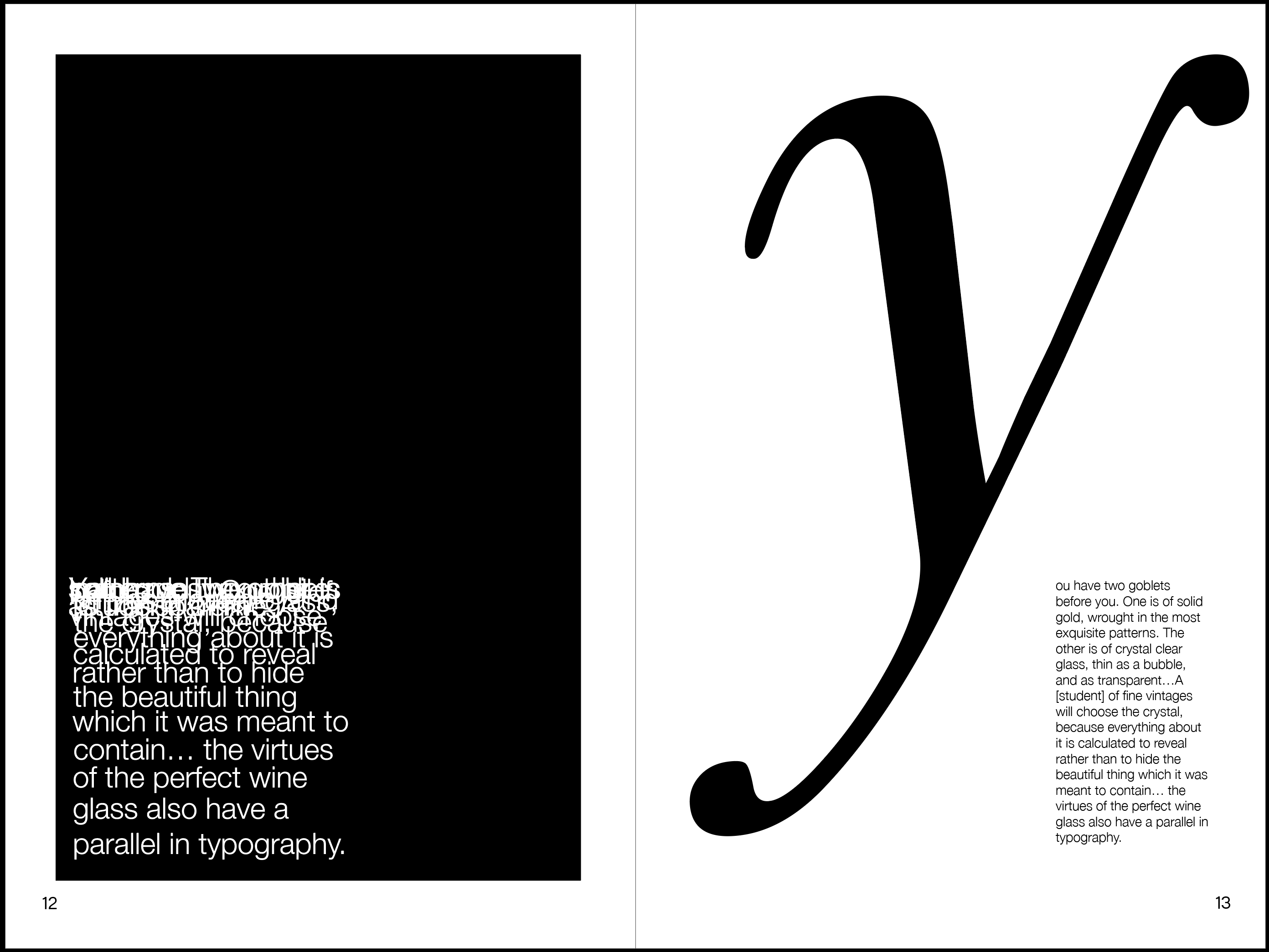
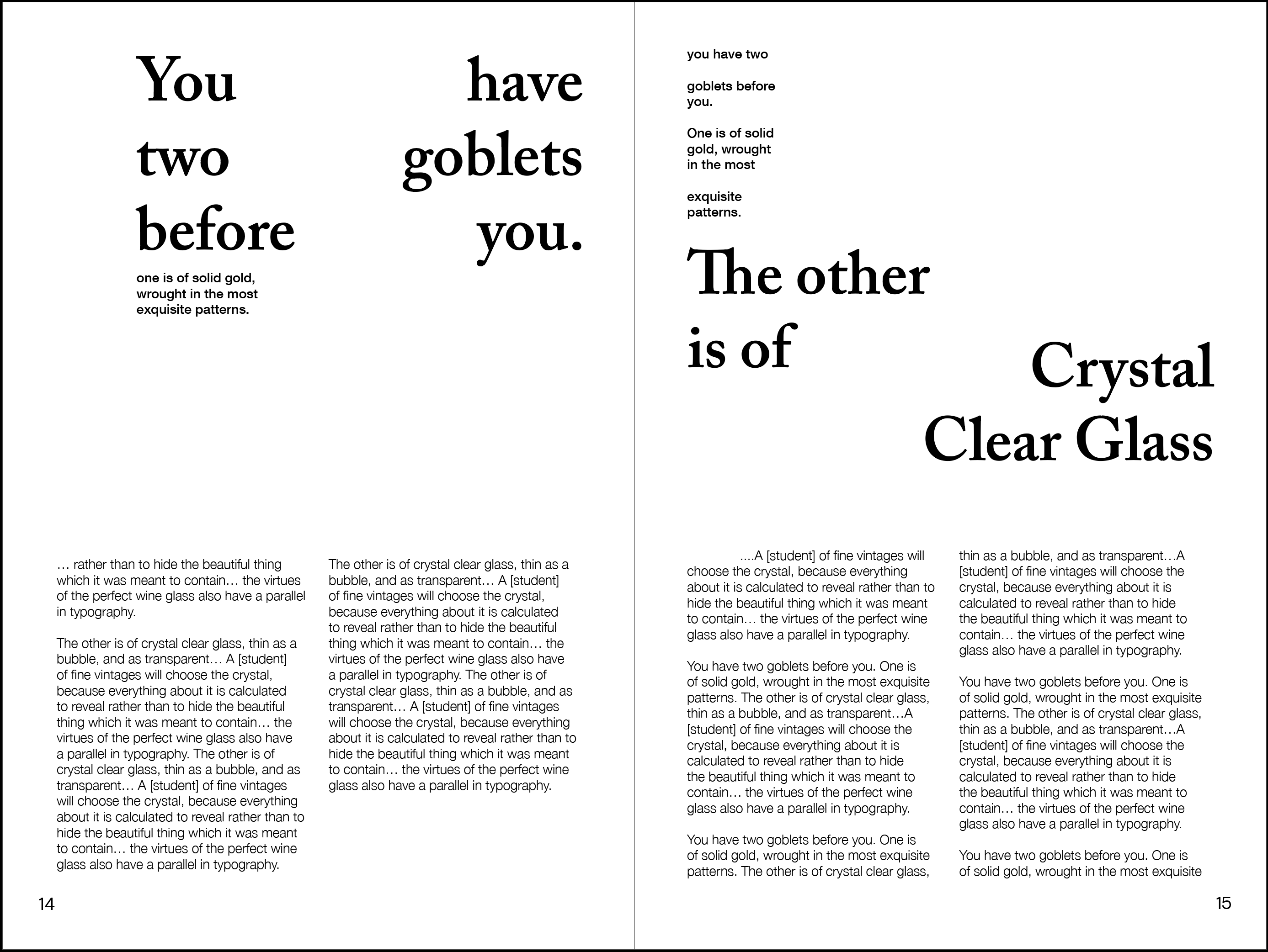
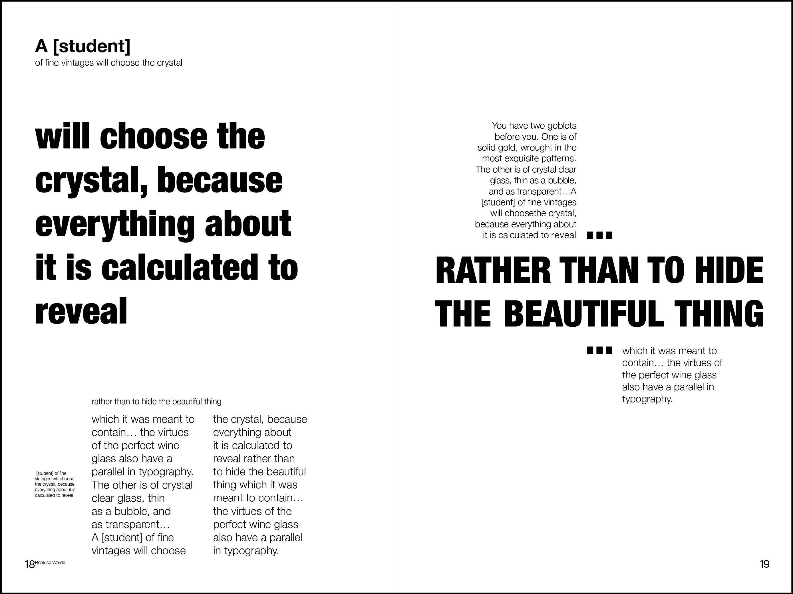
Beatrice Wade:
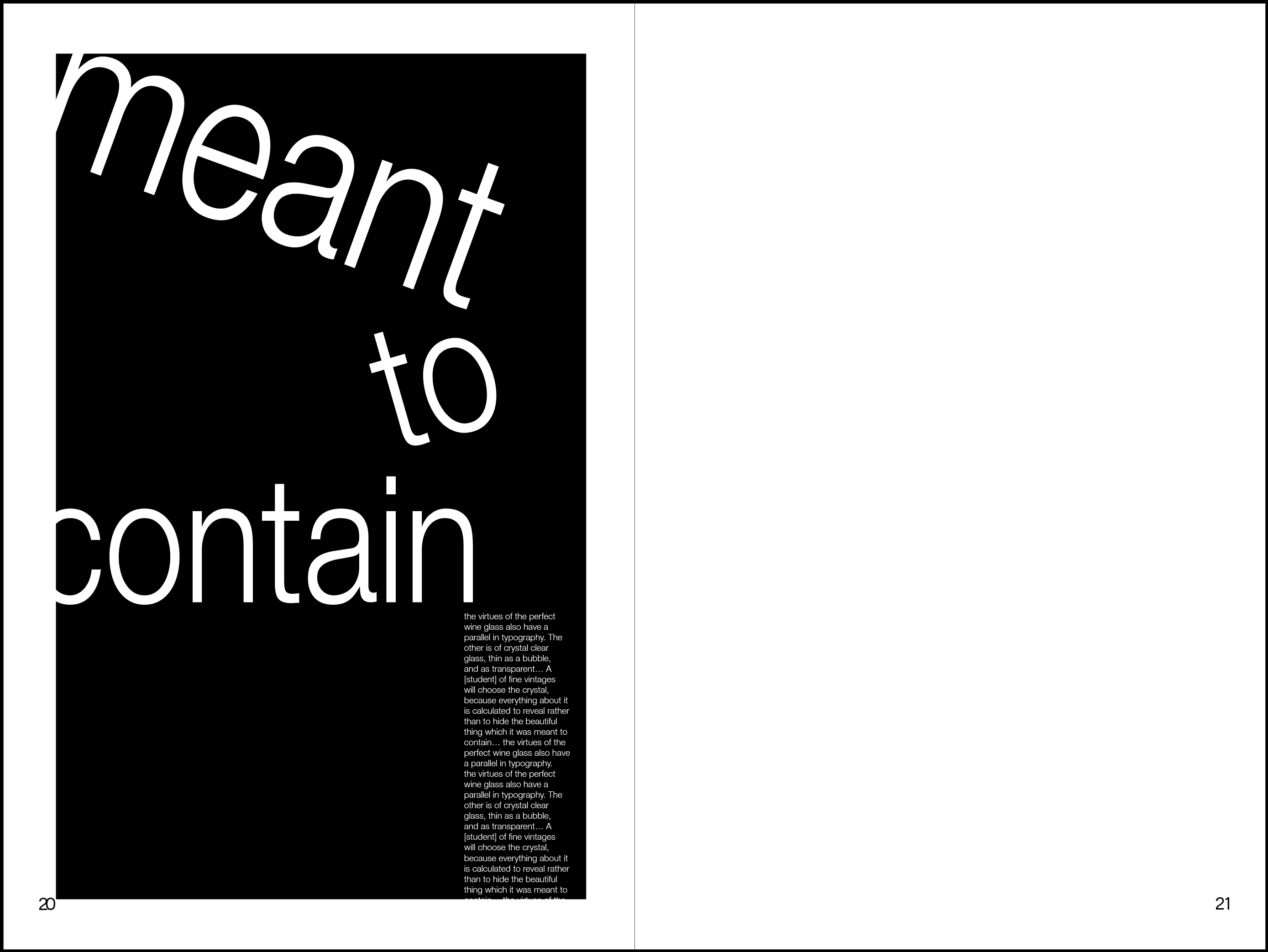
“You have two goblets before you. One is of solid gold, wrought in the most exquisite patterns. The other is of crystal clear glass, thin as a bubble, and as transparent…A [student] of fine vintages will choosethe crystal, because everything about it is calculated to reveal rather than to hide the beautiful thing which it was meant to contain… the virtues of the perfect wine glass also have a parallel in typography.”
Type designed to be figurative, but clear, distinct examples of composition. Trying to emulate magazine or newspaper layout in compliance with Beatrice Wade’s call for the necessity of clarity.


Jan Tschichold:
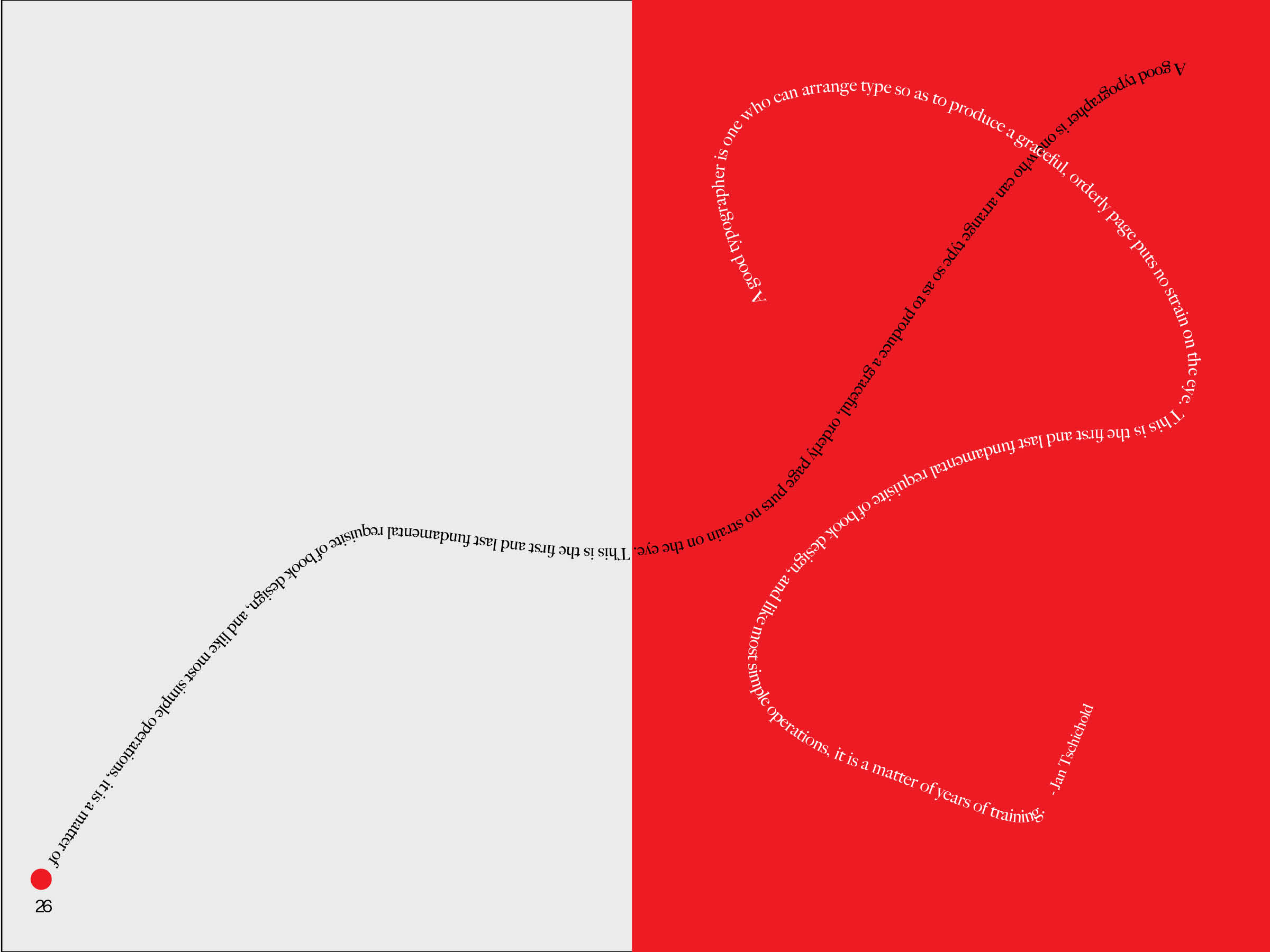
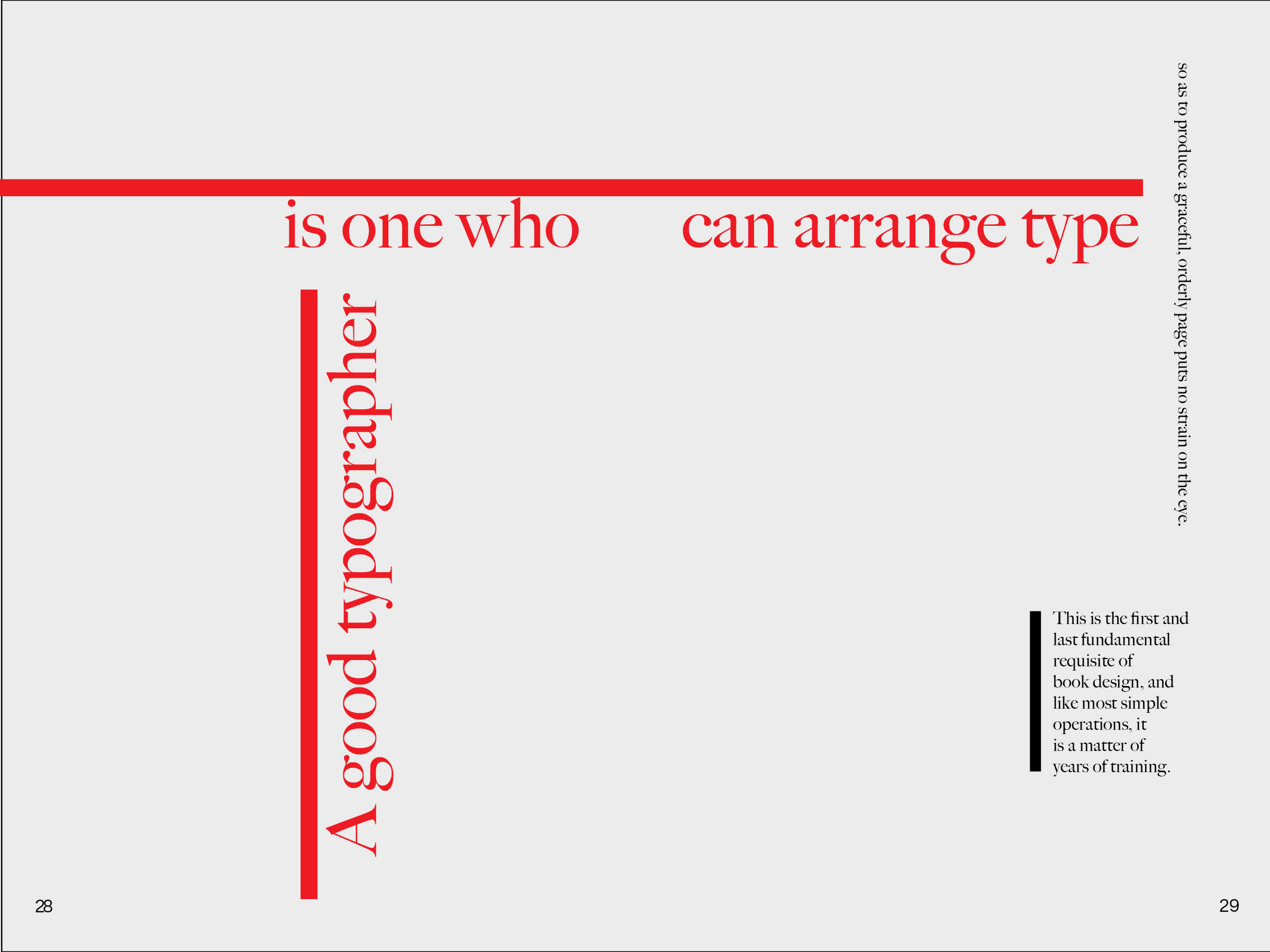
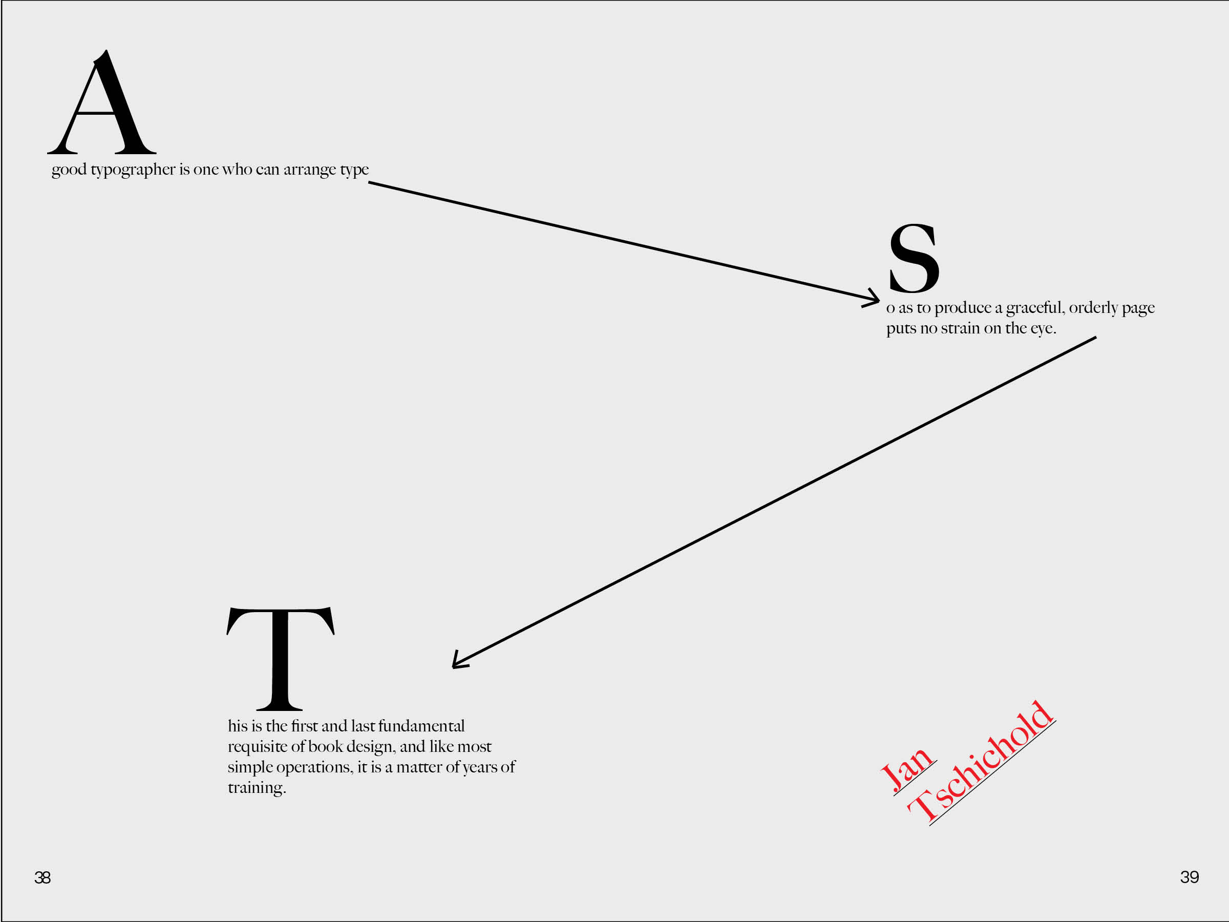
“A good typographer is one who can arrange type so as to produce a graceful, orderly page puts no strain on the eye. This is the first and last fundamental requisite of book design, and like most simple operations, it is a matter of years of training.”
Based off of Jan Tschichold’s own work, these typographic examples demonstrate illustrative compositions. Clarity is important here but not essential, color is also brought in as a distinctive highlight to make type more in line with Jan Tschichold’s philosophy.




Phil Baines:
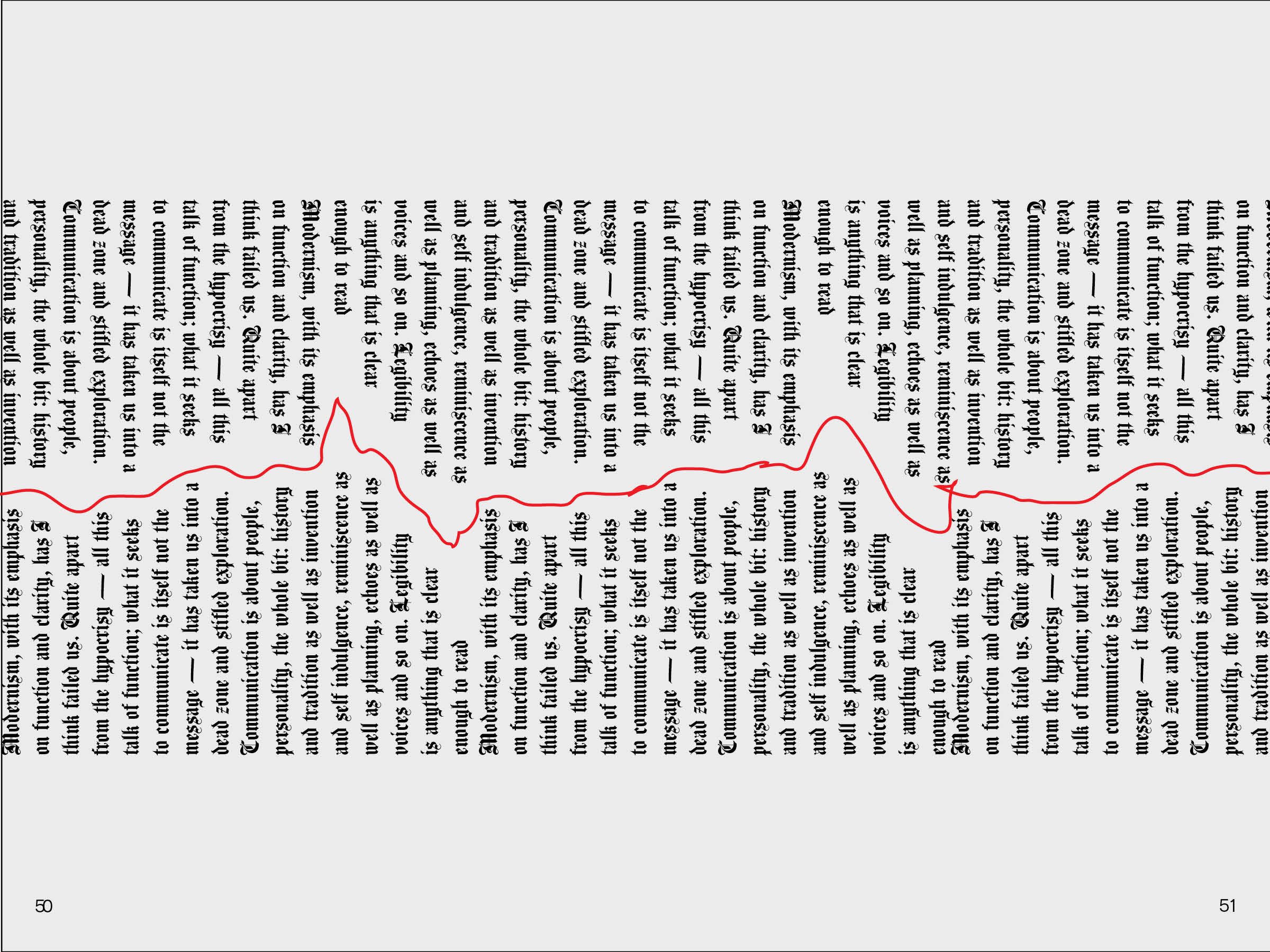
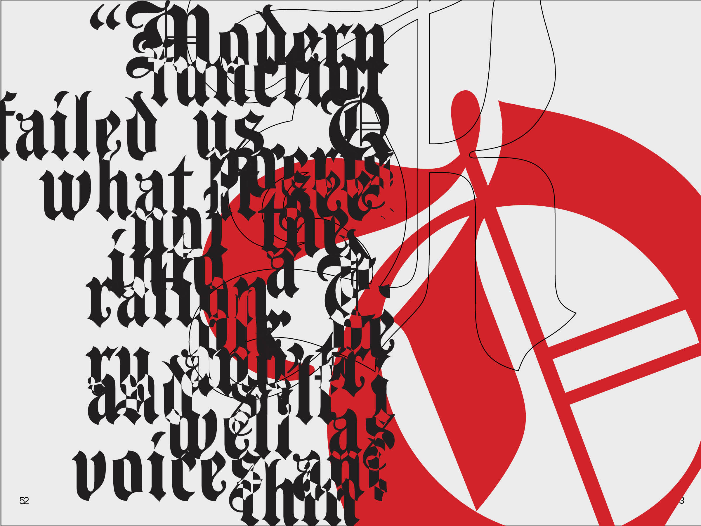
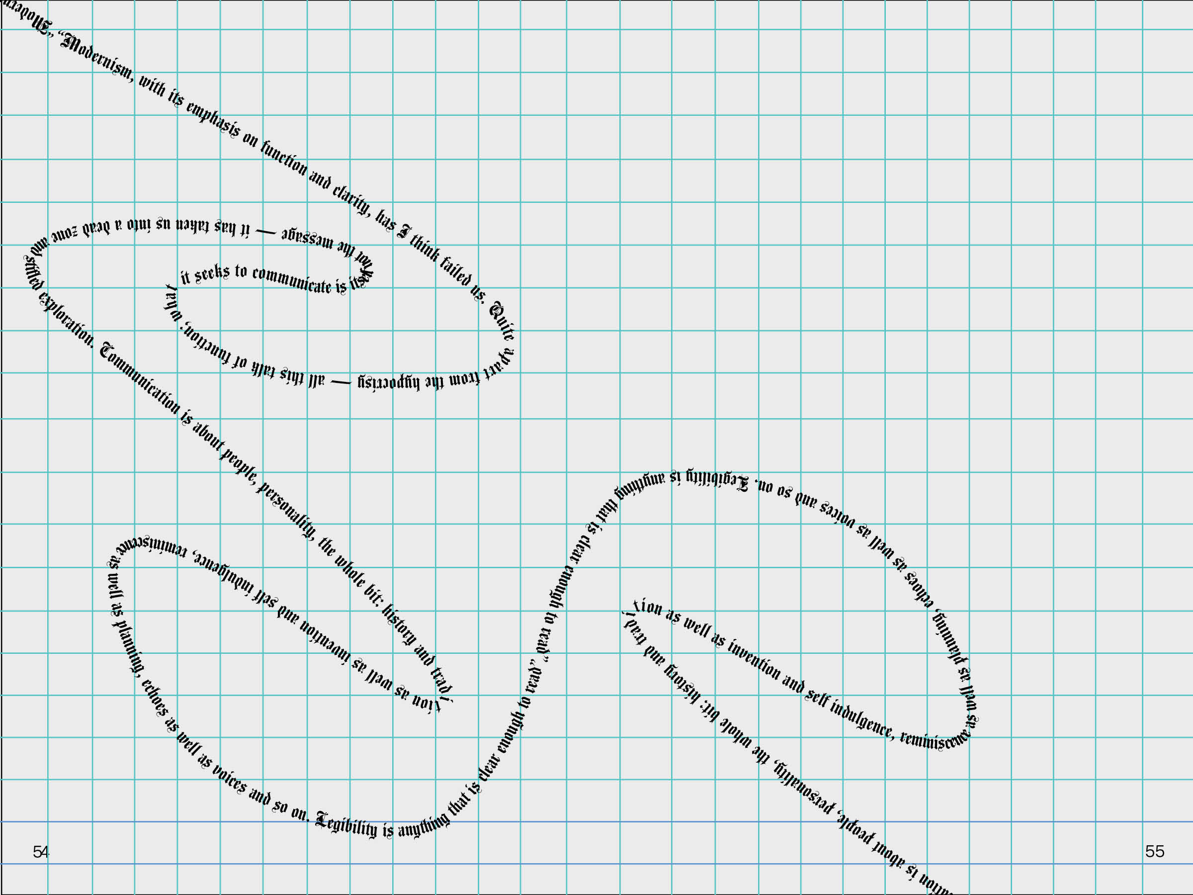
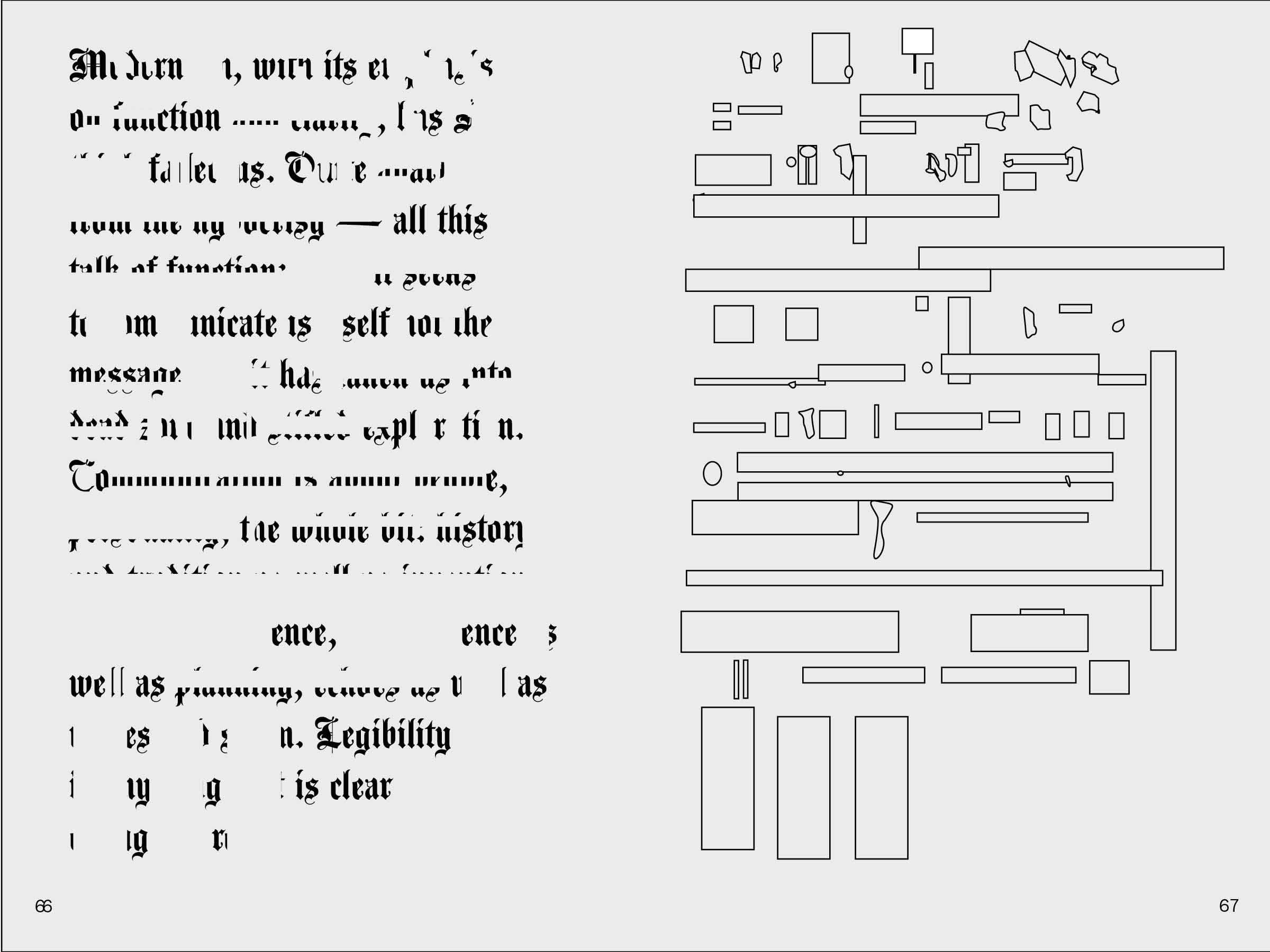
“Modernism, with its emphasis on function and clarity, has I think failed us. Quite apart from the hypocrisy — all this talk of function; what it seeks to communicate is itself not the message — it has taken us into a dead zone and stifled exploration. Communication is about people, personality, the whole bit: history and tradition as well as invention and self indulgence, reminiscence as well as planning, echoes as well as voices and so on. Legibility is anything that is clear enough to read”
These compositions were based off of Phil Baines’ lack of clarity in his own work and playful style with motion in his typography. While most of these are not quite “legible” per-se, the layout and feelings are more important than the words themselves.


Bradbury Thompson:
“Type is a thing of constant interest to me. It is sometimes a serious and useful tool. Employed to deliver a message, or give life to an idea *At other times it is a plaything that affords personal amusement and recreation.*An interest in Type provides a broader knowledge of history, including the appreciation of such related arts as painting, architecture and literature — and even buisness and politics * In short, Type can be a tool, a toy, and a teacher, it can provide a means of livelihood, a hobby for relaxation, an intellectual stimulant, and a spiritual satisfaction.* An interest in Type neccesarily includes a zest for the everday life.”
In Bradbury Thompson’s work he consistently used CMYK (cyan, magenta, yellow, and black) until they became trademark’s in typographic specimens. In these examples, the compositions use these colors in order to demonstrate motion and mimic Bradbury Thompson’s call for expressive modernity in his quote.


